
From a form to a ticket: how the app got its look
In short I Have No Self Control started as a spike built to be ugly and a plain app of system forms. Two design rounds were thrown away before research set the direction: a quiet register and a loud one, a volt green that never touches paper, a ticket for the time you earn. Then the first run was rebuilt twice, the curtain stopped selling, and watching my son use the app reshaped the screens where you set things up. This is how it went, in pictures rebuilt from the old versions and in the words I wrote at the time.
In a 2003 magazine piece on the iPod, Steve Jobs is quoted with a line I keep coming back to: “That’s not what we think design is. It’s not just what it looks like and feels like. Design is how it works.” [1] This article is mostly about the part you can see, what the app looks like, because that is the part whose changes can be shown. How the design decides what the app does is a subject for another article.
I kept no diary. What follows is put together from the conversations I had with an AI assistant while building the app, from the project’s git history, and from pictures of the old versions. AI tools searched the transcripts and the history and rebuilt the pictures. The quotations are my own messages from those days, translated from German [2].
What this does not show
The pictures of the app are rebuilt, not kept: each old version was built again from its commit and photographed on today’s simulator and iOS, so type and system parts can differ slightly from what my phone showed then, and apps appear as grey stand-ins, because a simulator cannot see real ones. The canvas boards are drawn from the files as they stood at the time. Screens that only a real iPhone shows are my own screenshots from those days, or missing.
The spike, ugly on purpose
Before there was an app there was a spike: a throwaway build to find out whether iOS lets an app do this at all. It was meant to be ugly. The one design finding it produced shaped everything after it: the curtain that falls in front of a blocked app is not the app’s own screen. It is Apple’s, and an app fills in its parts: the background and its colour, an icon, a title, a subtitle, the labels of a primary and a secondary button, and the primary button’s colour [3]. Whatever the curtain says later in this article, it says in those fields.
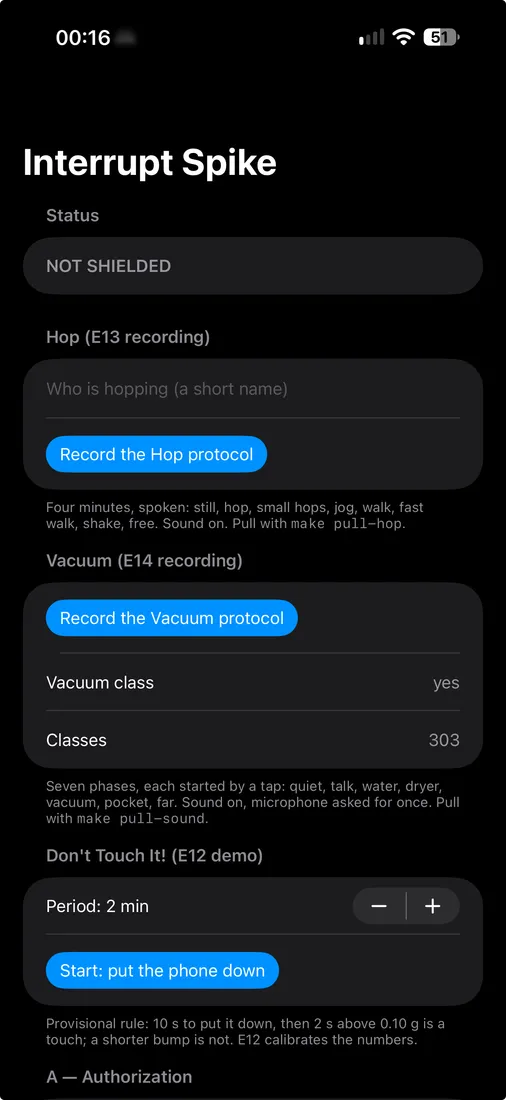
The plain app
The first real version was built from the system’s own forms: lists, switches, steppers, and a title that said Interrupt. It worked, and it looked like a settings page. I noted it in passing while testing something else: “The UI is rather… utilitarian right now…” [2] This version only runs on a real iPhone with Screen Time allowed, so there is no rebuilt picture of it yet.
Two rounds thrown away
Then the design work started, with Claude Design proposing directions. The first round had three: calm and close to the system, editorial with a serif on warm paper, and playful with a colour for every Pool. My verdict: “All of it is far too tame and too boring for me. Too much like lists and tables, too little illustration, too little whitespace.” [2]
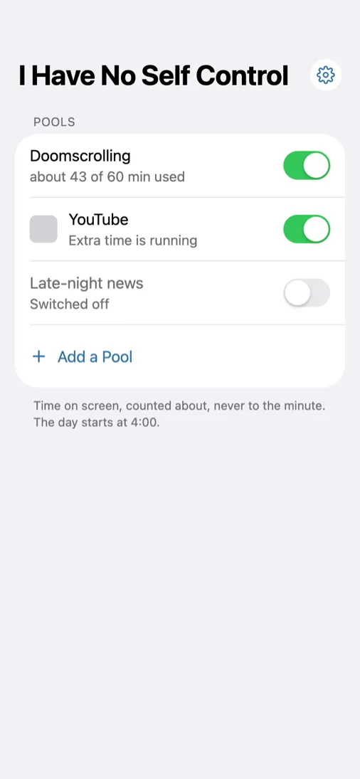
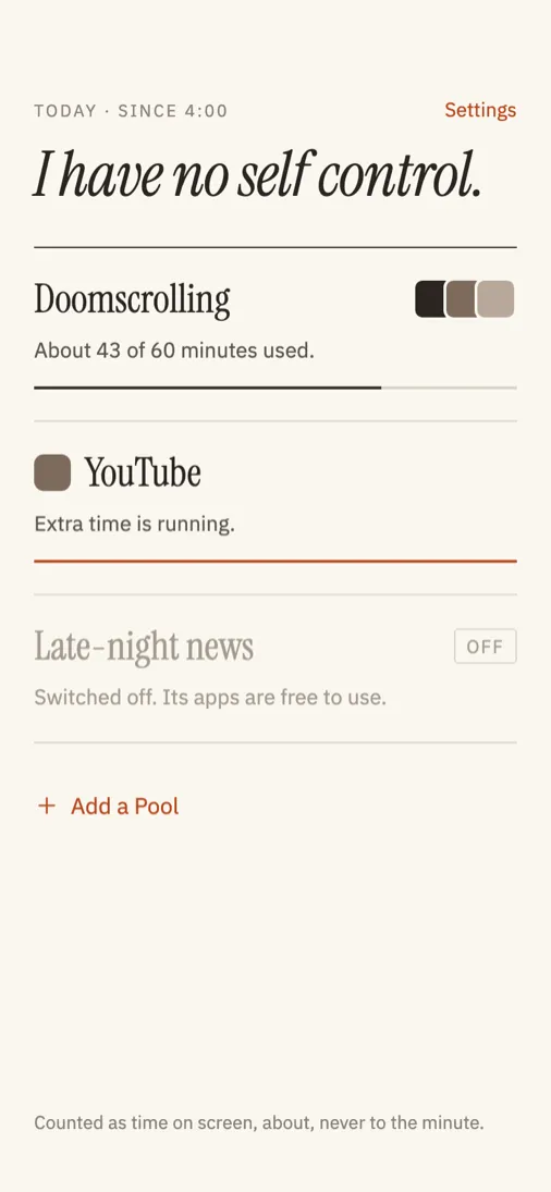
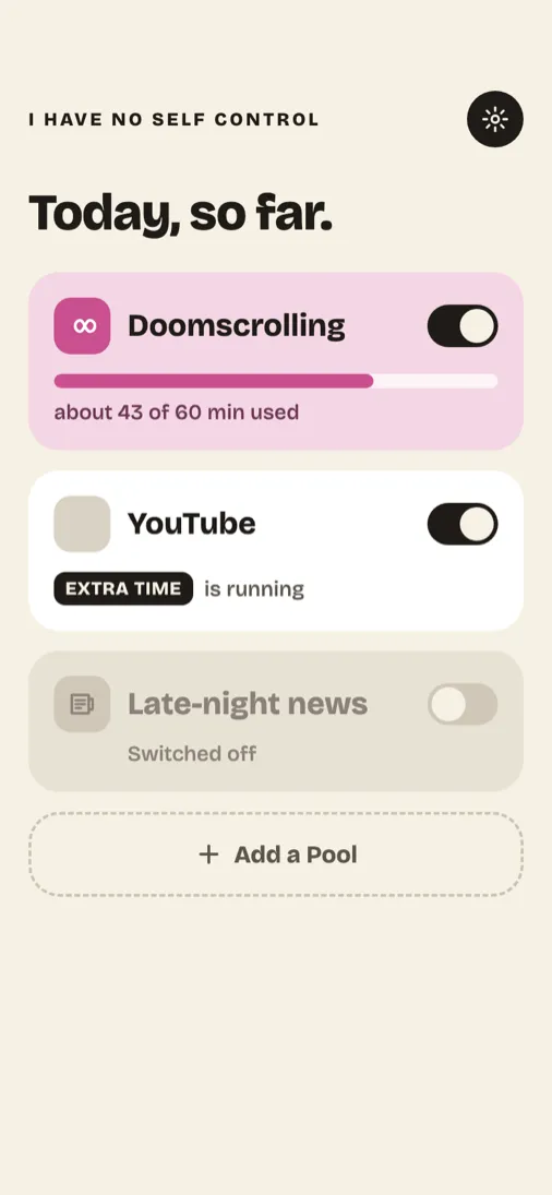
The second round went louder: thick outlines, strong colours, round shapes for the Pools. It was the first time the time you earn appeared as a ticket. I did not take to it either: “Somehow I don’t take to this one either, or it’s impractical.” Then I stopped the guessing: “Before you keep guessing until something fits, go and research design principles, especially for software of this kind.” [2]
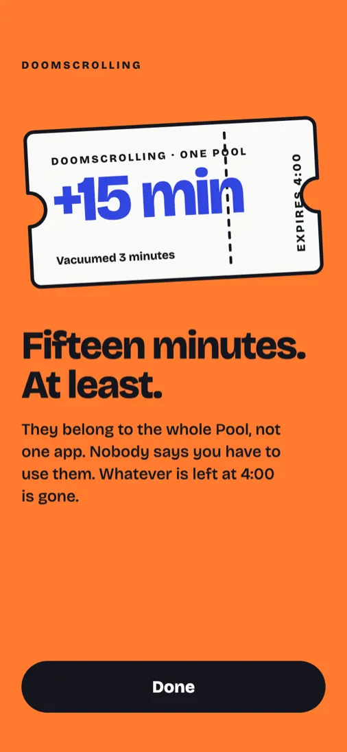
The research that followed looked at studies of apps like this one, at what makes a screen readable with ADHD, and at what the market looked like. One finding went straight into the design: in an online experiment that tested the features of the app one sec separately, offering the option to dismiss had the strongest effect on lowering how much video people watched [4]. Every screen of mine that interrupts has a way out with a button of its own.
Volt green, and two registers
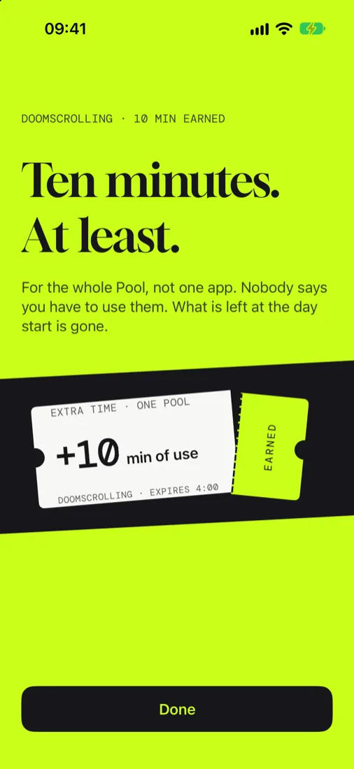
The third round, the same evening, was one direction instead of three: a quiet register for the everyday screens, paper and ink, and a loud one for the moment the app interrupts, with a big serif, Gloock, for the headline and hand-drawn chores beside the prices. This time: “It’s clean without looking prim. It doesn’t hit you over the head, but it stands out. It’s elegant, but not snobbish.” [2]
The loud colour was mustard at first: “I like the mustard yellow, but as a child of the GDR it brings back all sorts of nostalgic, musty memories.” I asked for more palettes, and I showed a screenshot of an earlier, much louder draft: “But the green in it is absolutely fantastic” [2]. That green became the accent.
Two rules came out of that evening. Green never touches paper: “Sadly, green on a white ground is enormously hard for my eyes to make out. Not only that: it hurts.” So the green only ever sits under ink, or fills a shape that ink frames. And loud means a coloured ground: when that was about to go, I wanted it kept. The second typeface, DM Mono, a monospace, came from the same evening, as an experiment: I thought it might be a focus aid for an ADHD brain, which spots whatever is unusual very fast, and could point to what matters on each screen [2].
An evening on a paper ticket
Early that evening, testing the plain app, I had noted of a clumsy stepper: “It’s a UI thing. We’ll have to work on that later anyway.” The first version of the app was still being built, and not one styled screen existed in it yet. “Later” came the same night [2].
On the canvas, the ticket from the second round now sat on a black band, and the two were tilted by different angles: “I’m not sure yet, though, whether the autistic part of me can cope with both the band and the ticket itself being tilted by different amounts.” In the same breath: “I’m a very big fan of small animations of the ‘oddly satisfying’ kind. The ticket and the band are practically screaming for an animation like that.” [2] Autism, in my case, is suspected, not diagnosed.
The first animation already said more than I had asked for: “At the same time it suggests: valid from now”. Then came an hour on how a paper ticket flies in and tears. Real tear-offs, I explained, “are always folded up and down first, so that the material at the perforation weakens a little”. The two parts still moved in step: “They have to behave like separate objects”. Parts of it still looked robotic, and I had a guess why: “I think the trick to keep it from looking robotic is that there must never be a standstill, because nothing like that exists in nature either.” [2]
Then, at last: “I think we can leave it at that. Which screens are still missing?” A few minutes later I was already eyeing more, the resolvers being the app’s word for its prices: “The resolver states all need oddly satisfying animations as well. That’s almost another project of its own :D” [2] The band and the ticket now share one angle, and the stub is torn off every time a price is paid.
The first screens, and dark mode
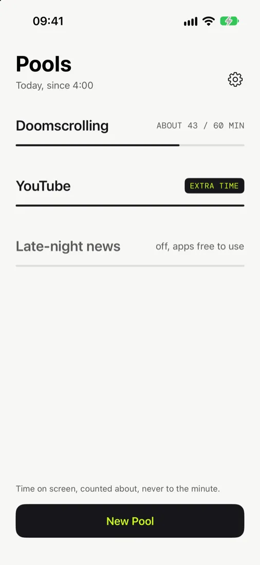
Next, the first screen was built from the boards: the list of Pools, still with the system’s type in its titles. Later that night, with a few more screens built, I saw them on an iPhone: “Wow, that looks great on the iPhone 12!” [2]
Dark mode needed a second go. At first, the box a button sat in stayed white in dark mode, because the style guide said so: “Let’s be honest: dark mode exists precisely because people do NOT want to be yelled at by white surfaces.” [2] The blocks now stay dark at night, and the green is dimmed. The Pool editor shows the difference.
The first run, rebuilt twice
The first idea for the first run was a few screens to read, one of them asking for your first Pool. It was drawn, never built. What I wanted instead: “There is nothing I HATE more than an app that forces me through its whole onboarding. Cancelling has to be possible at any time.” [2]
So the first run became a rehearsal you play: the app interrupts a pretend feed, you pick a price and earn the ticket, and every screen has a way out.
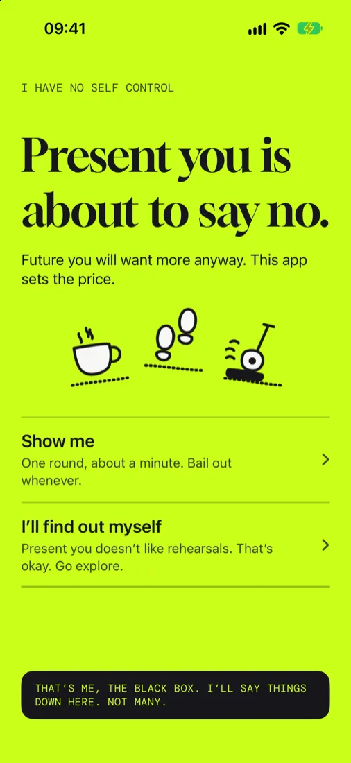
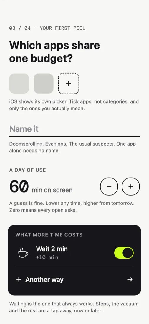
Two days later I found it still wanted to explain too much at once. Being made to set up a Pool straight away, as an earlier version would have had it, would have put me under pressure myself, and a wall of text and screenshots to click through was useless: “And I think you have to FEEL it.” [2] The second version puts the why first and hands you a Pool already filled in, with one thing left to choose: which apps.
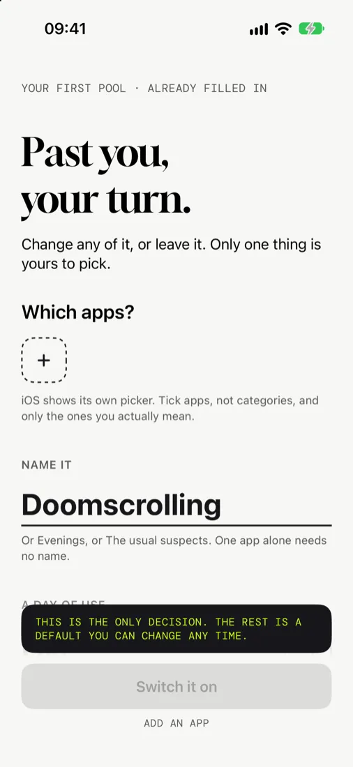
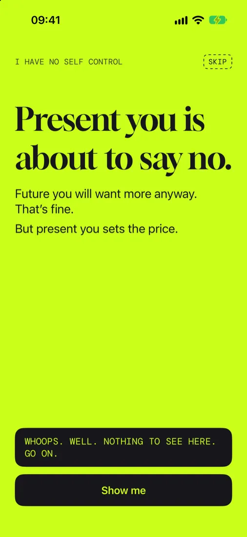
Then the first screen itself. Its first choreography was, in my words: “Soulless, too fast, no room to breathe.” [2] The one that stayed takes its time: the black box that is the app’s voice speaks first, the page says its lines, and the button, sliding in, shoves the box out of its place, which answers with a small, embarrassed line.
A curtain that sells nothing, and the name
The curtain kept to the fields Apple allows and still changed its tone. At first it stood on a green-tinted ground, with a filled button for more time and a subtitle that sold it: You can have more time. It costs something. Later I wrote: “Curtain: I’m in favour of making it more neutral anyway.” [2] Now it names the Pool, states a fact, and offers two ways out of equal weight.
The name was settled late. I Have No Self Control had been the candidate for the app from early on, with Better Screen Time as the project’s mission, which it stays, and in the end it became the app’s name: “It’s to be seen as a self-mocking wink. So yes, it’s a person’s statement about themselves, not a judgement.” [2] That is why it says I, and not you.
One frame for the prices, a new Pool editor
Watching my son use the app changed the screens where you set things up: “When I watch my son use the app, one thing strikes me very strongly: it rarely occurs to him to scroll.” It was not only him; I often had the same trouble on those screens [2]. The editors for the prices had each grown a layout of their own, long enough that the Save button lay over what came below it.
They now share one frame: the price’s drawing and name at the top, then a row for the price and one for what it pays, each opening in place, and Save within reach of the thumb. “Predictability matters a lot here.” Behind it is also how I read a screen: “To my eye, a paragraph of text is practically the same as a button. Of course I can still sort them out, but that takes active thinking and is tiring.” [2] Fewer things on a screen, and most of them things you can act on.
Talking over the order and the folds of the new price editors, I worried about screens that look alike: “I’m worried we’re building too many screens that look the same. That can get confusing fast, especially when a sub-screen looks practically the same as its parent. That’s my worry, a little, at least.” And then: “The Pool editor has to be built differently, on purpose” [2]. It now shows the apps as a stack, and each price as the ticket it would earn.
What stayed
My preference
Where the evidence was thin or contradictory, I always went with my own preference, because the app is meant for me to use. Those choices can only be good for me; for others they may grate, or even be a red flag. I call it character.
Through all of it, a few things did not move: the sentence the loud screen opens with, Past you said no., and the ticket at the end of every price you pay. The design is not finished, and this article will grow with it.
Sources
- Walker (2003). The Guts of a New Machine. The New York Times Magazine. www.nytimes.com. Accessed 2026-09-28. News report↑
- Fuchs. Messages written while designing the app, September 2026. Maker's notes↑↑↑↑↑↑↑↑↑↑↑↑↑↑↑↑↑↑↑↑↑
- Apple (2021). Meet the Screen Time API. WWDC21. developer.apple.com. Accessed 2026-09-25. Platform documentation↑
- Grüning, Riedel & Lorenz-Spreen (2023). Directing smartphone use through the self-nudge app one sec. Proceedings of the National Academy of Sciences. doi.org/10.1073/pnas.2213114120. Field study↑
This site belongs to an iPhone app: a daily limit on the apps that pull you in, and a price on more time, both set by you earlier. See how it works